PROJECT OVERVIEW
THE PRODUCT
The primary users of the App are people in between their late 20's and late 40's with busy working schedules, crazy hours because of their kids or similar situations that make it harder for them to organize an evening out with their friends.
Duration: December 2021 - January 2022 (ongoing)
THE PROBLEM
People in their 20's and late 40's have troubles organizing dates with their friends as they sometimes can't even get together to organize. There's too many options and too many things to do in order to successfully plan and evening out without loosing all interest in the event along the way.
THE GOAL
Design and App that will allow users to easily choose and event and invite their friends to a scheduled event without making it tiresome.
User research summary
After researching there were many interesting findings: Not only is a problem for young adults and older to organize an evening with their friends, there's also, for example, the problem of who buys the tickets if it's a concert; or how do you tell your friend that's always late for everything that they need to decide by a certain date if they are coming or not?
IDEATION
Some of the first steps included thinking about the main flow for the users and which would be the key points through it that they would have to navigate through. It all started with a simple flow, but later it would become evident that it was not as simple as it seemed.

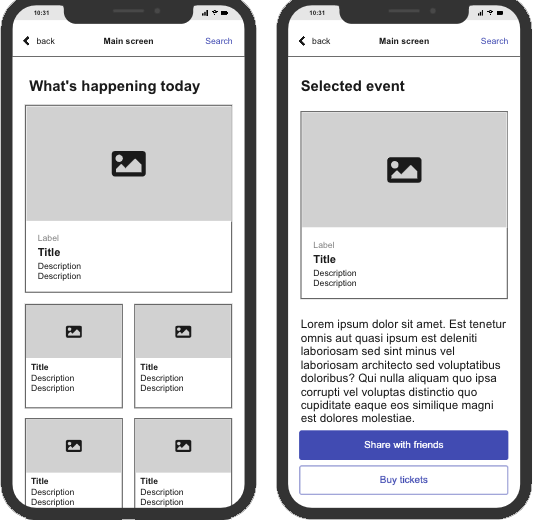
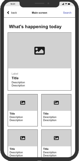
Digital Wireframes
After the Ideation process on paper, moving onto the Digital Wireframes helped to visualize some underlining problems about the order of the flow actions for the user and what would be the best steps for a more optimal flow.
It was also observed after a few iterations of the Wireframes, that there was a big need to adjust the wording and some of the call to action buttons.
Usability study findings
VISUALS: Most users mentioned that even on the wireframe the small touches of color here and there made it easier for them to navigate through the App, so it's important to keep that in mind while moving onto the Mockups and HI-FI Prototype.
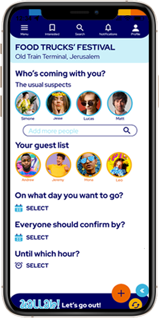
CLICKING: Several users liked that in just a few clicks they were able to organize where and when to go and with who.
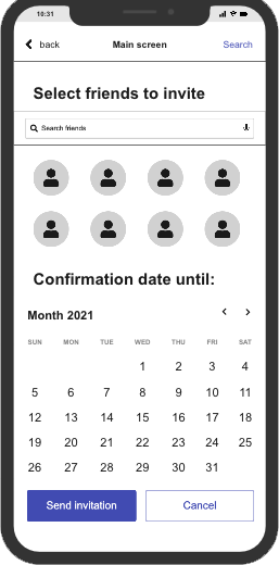
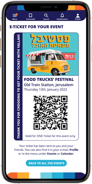
TICKETS: Many users complained that they did not see the e-ticket as soon as the process finished and that it wasn't clear where they could find it after they had purchased it.
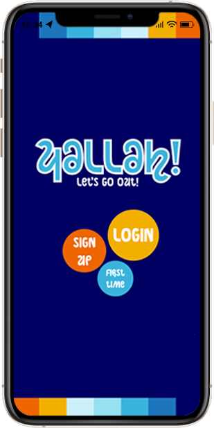
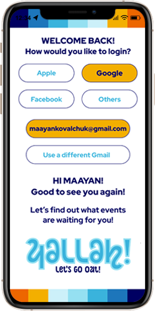
Mockups
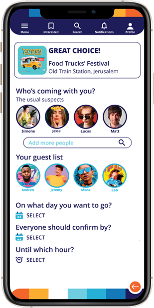
As the Mockups were being build, the focus was put into bringing more colors to the App while keeping it functional, and also implementing changes such as, in the area where the user invites their friends, it's easier to understand what to do and where to tap as there are clear indicators.
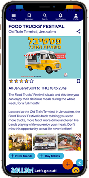
High-fidelity prototype
There were more usability studies conducted as the App continued to take form, and as the process moved on, there was a clear need to make the visuals easier on the eyes. The App got a brighter and more clean look, with less elements on the bottom navigation bar and an overall redesign of the main call to action buttons and images.
GOING FORWARD:
IMPACT
A great number of users during the research shared that they were sceptic in the beginning, but after trying out the App, they could see themselves using it not only to plan a night out with their friends, but with just their partners or even for themselves.
WHAT I LEARNED
Still learning from this project as it's still going on, but the main take away right now is that sometimes even the things that seem trivial to some of us, could be of great help for others in making their lives easier.
NEXT STEPS
Conduct a new usability study on the App again to check the new added workflows.
Keep working on the features relevant to users such as an option for going out alone and add the even to the phone calendar.
Keep improving the design to achieve the best looking option that makes the experience visually entertaining for the user, but not overwhelming.
Thank you for taking your time reviewing my App for "Yallah! Let's go out!", I hope you enjoyed it!