PROJECT OVERVIEW
THE PRODUCT
Pawpify is the website for an animal shelter with various locations around the US. They are committed to find a home for all of their residents and for that, they would like for their web to provide an easy way to see all the animals and apply for adoption as well as other activities available at the shelter.
Project duration: November 2021

THE PROBLEM
Shelters have non appealing, hard to navigate and confusing websites making it harder to apply for adopting animals.
THE GOAL
Pawpify wants to provide through their website an engaging and easy to approach way to adopt the animals, so they can find forever homes as soon as possible.
User research
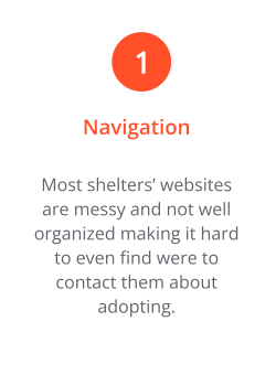
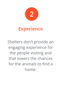
During the various researches conducted, it became clear that the larger obstacle in adopting an animal form a shelter was the complex navigation system that most websites presented.
The researches not only showed that people would get frustrated and abandon the process in the middle, but would most likely be less inclined to consider adoption because of all the bureaucracy involved. Only after a few iterations of the website, we saw an increasing positive feedback at the simplicity of the design and the application approach.
Pain points

SITEMAP

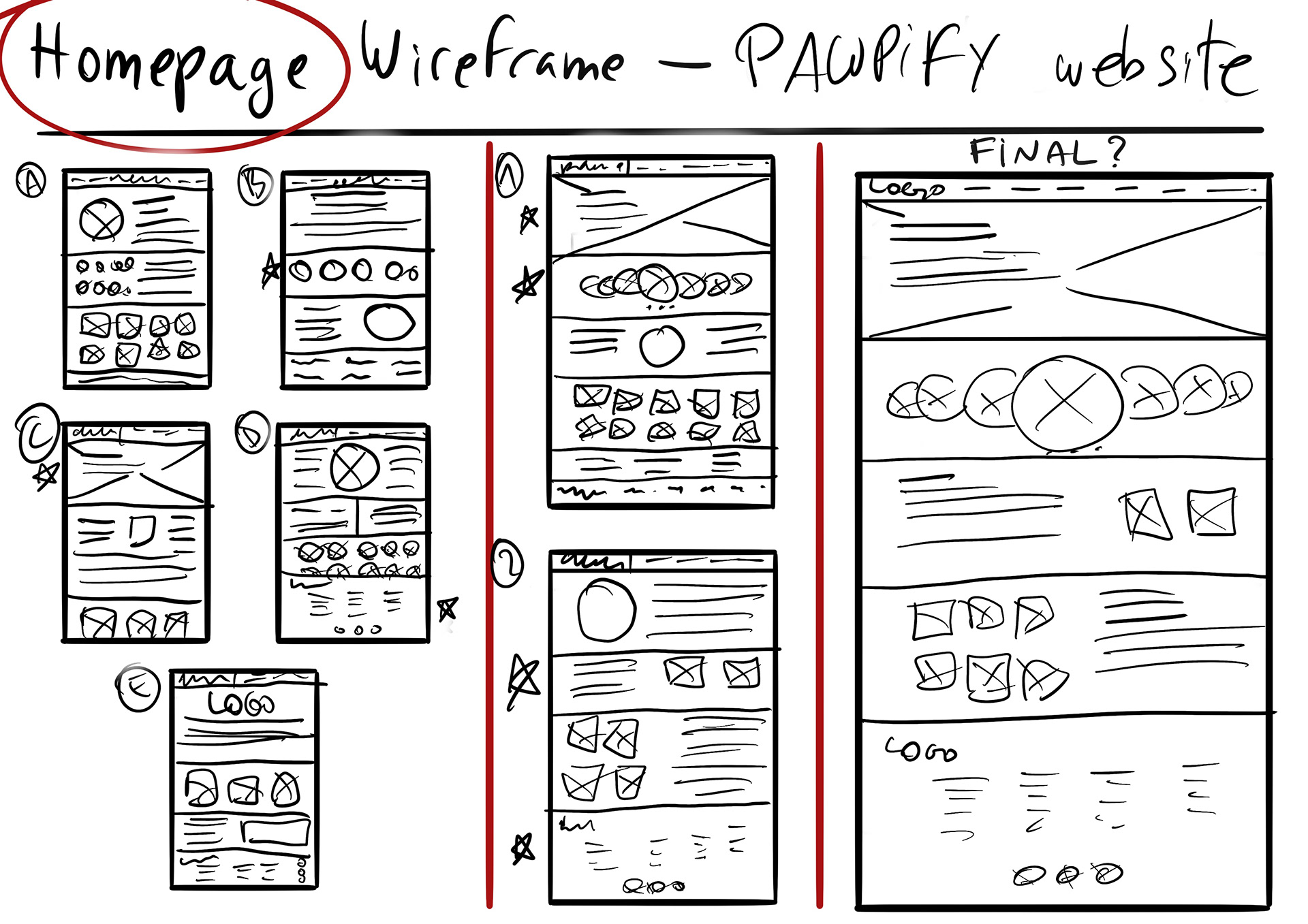
Paper Wireframe
While sketching on paper, the main focus was to try and make the website look simple to navigate and user friendly. The idea is to put on spot the shelter’s message as well as the animals up for adoption, so there will be a lot of images.
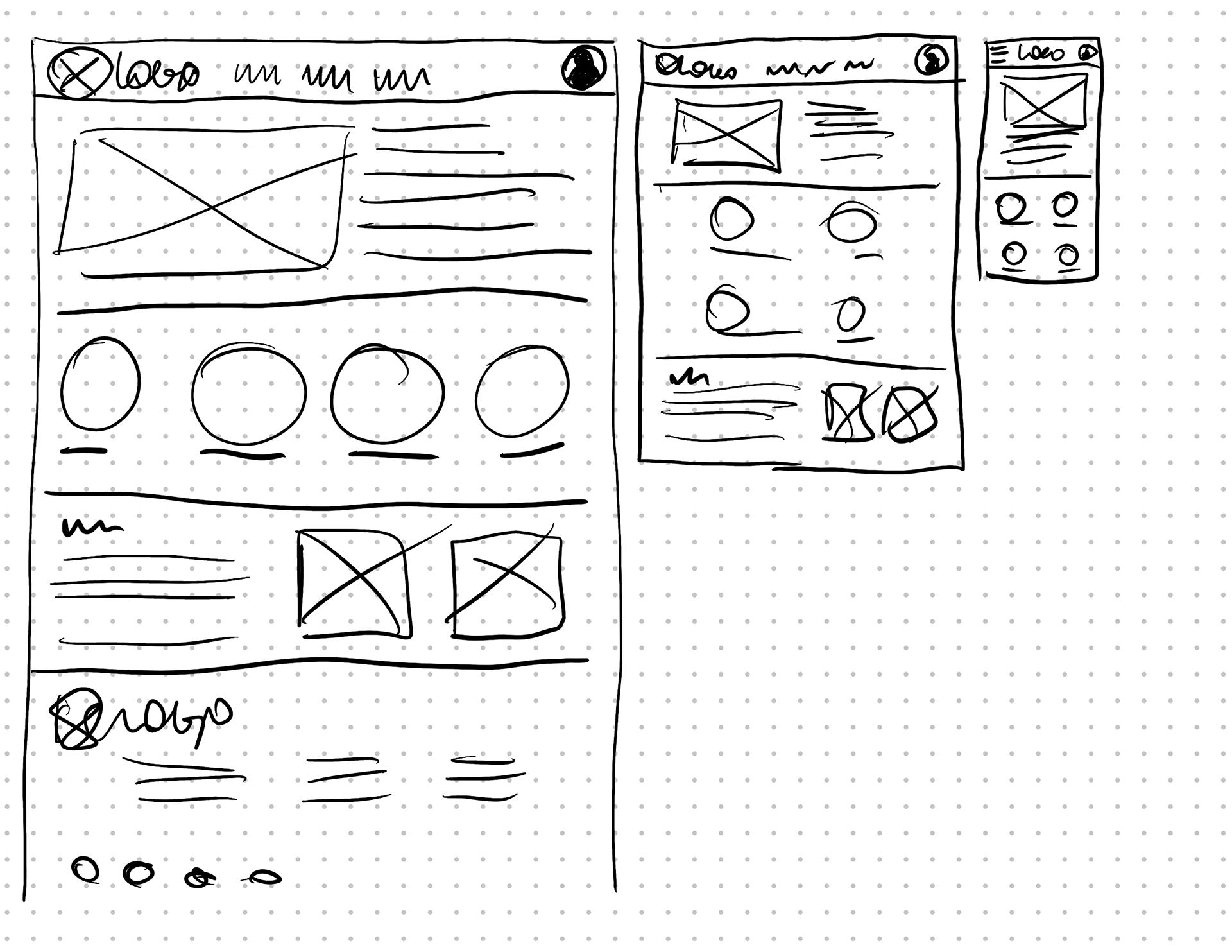
Paper wireframe: screen size variations
To make sure the website could be accessible from multiple devices, a few ideas were sketched on paper to start to grasp how to go about properly adjusting the website to each screen. Rearranging image and text size was key for the phone size, while for a tablet we found that we could keep the same size horizontally and just had to adjust for a vertical view!
Digital wireframes & screen size variations
As many users pointed out, a lot of times while using a tablet, it's vertically, like a book and not horizontally like a desktop computer, so the main focus was on how to transition to a vertical design for tablets and phones. Of course for phones we also had to take into account the even more reduced space.

Low fidelity prototype
For this low-fidelity prototype the main focus was to complete the adoption application. We focused on making it easy and short, not having to click through too many pages to complete. This is the second instance of the prototype after feedback from users about still feeling overwhelmed about the amount of steps they had to take to start the adoption.
Usability study
PARAMETERS
Study type: Unmoderated usability study
Location: United States, remote
Participants: 7 participants
Length: 15-20 minutes
FINDINGS
LANGUAGE: Users did not like the language used, they still found it too detached and not involving.
CHECKED MEMBERS: Many users were worried that the applications could be done by people without having background checks and feared that non qualified people would apply.
FOLLOW UP: There were several users that weren't sure about how to proceed after sending the application form, which were the next steps that followed.
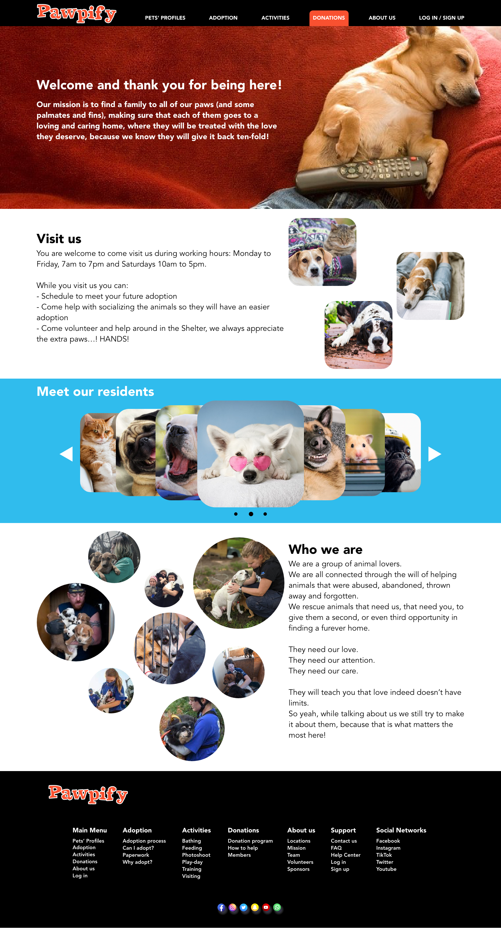
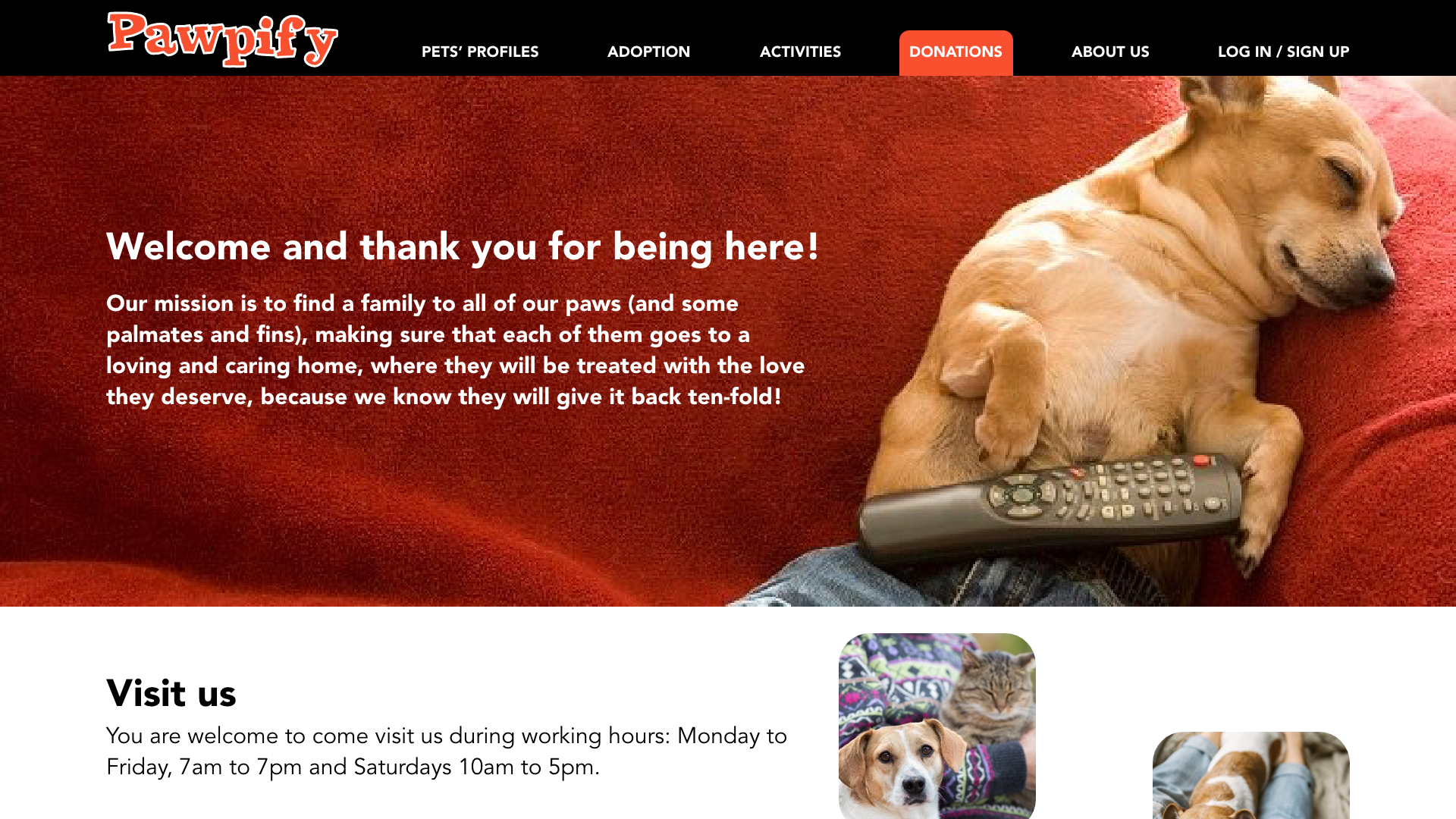
Mockups
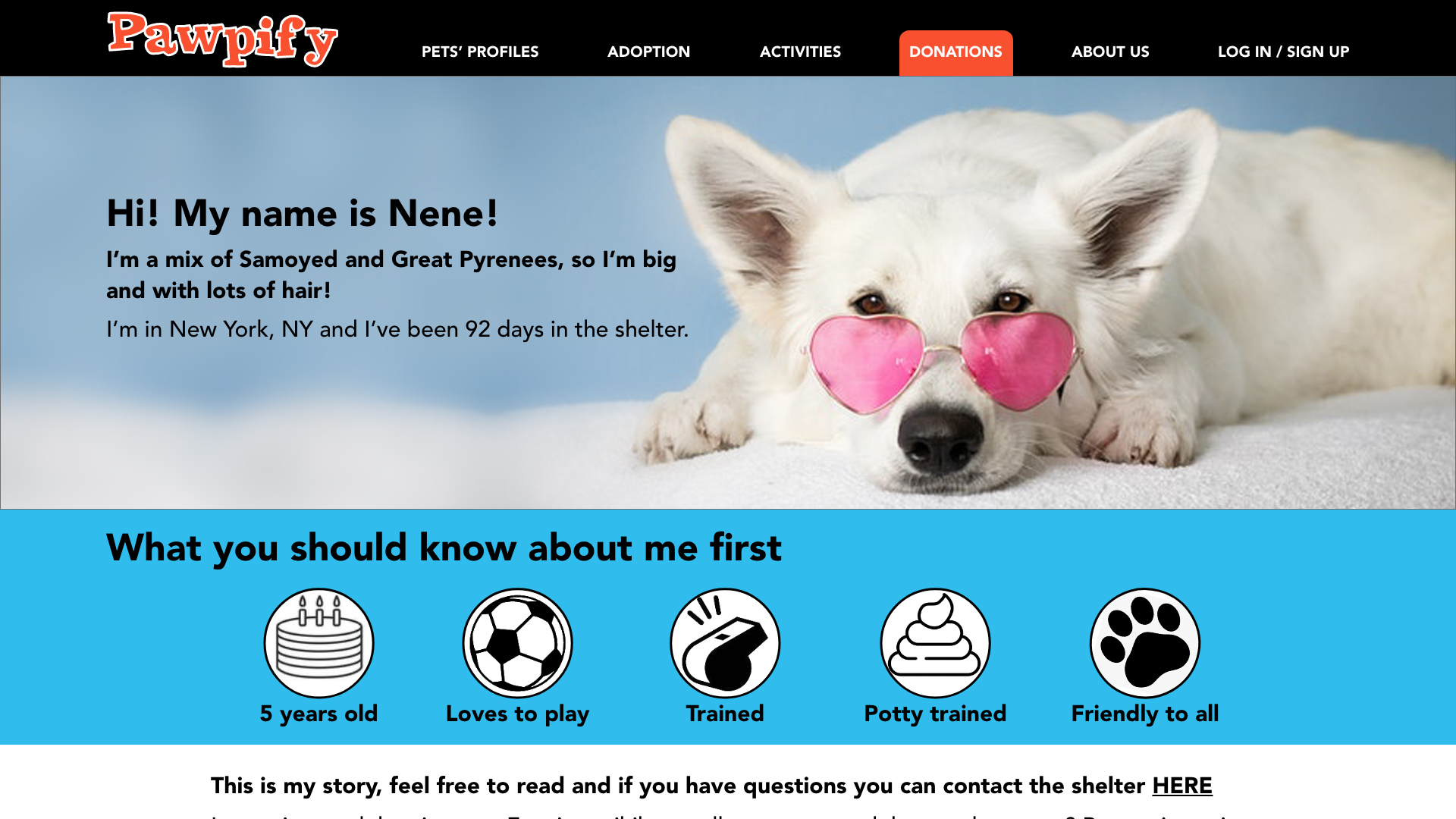
We wanted to apply as much emphasis on the friendly look of the website and the welcoming feeling users were requesting, so we went for a bold hero image with some text for the homepage and followed with other photos and more information about the shelter and the animals.
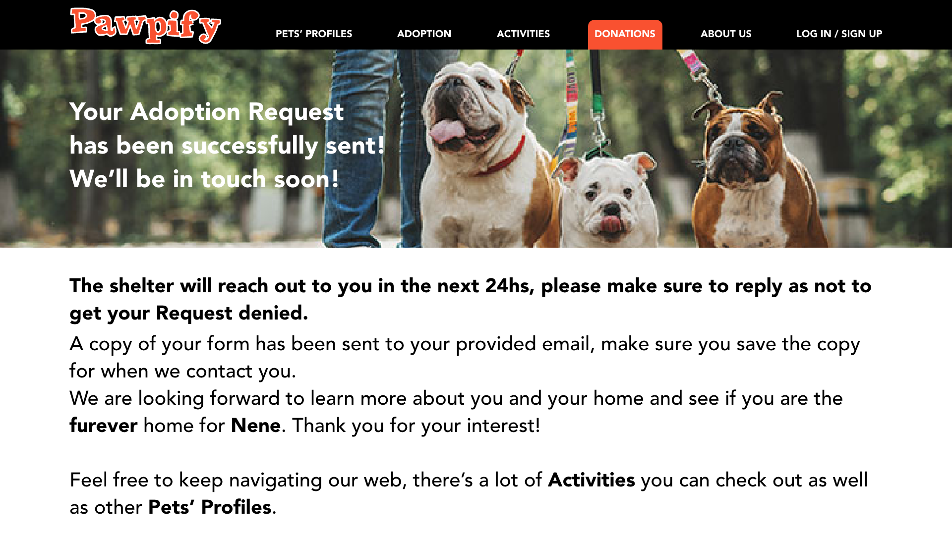
It was also important for users to know what happened after completing the adoption request, so we improved the final page to properly inform them of what to expect next as you can see below.


Mockups: Screen size variations
It was challenging to adapt the website to the phone screen, but we kept the main focus on an easy navigation and user engaging look, with the same happy images throughout the design trying to keep it as consistent as possible with the desktop website.
Both HI-FI Prototypes can be seen here:
Accessibility considerations
1- Hierarchy headlines were used as well as clear contrast within the different text parts to make it clear and easy to navigate for anyone.
2- We included as many ALT text as we could, as well as extended descriptions for the animals’ pictures.
3- For those who are dependent on AT, landmarks were included throughout the website to help them navigate without troubles.

Main screens' mockups

TAKEAWAYS
IMPACT
Users were excited and surprised about the design and look of the page, how different it is from other pages they’ve visited before and how much more easy to navigate it is. They found the new language used more friendly and inviting and felt even more “accompanied” during the Adoption Request process.
WHAT I LEARNED
I learned that when it comes to things that are not products, the user isn't expecting a formal website all the time, they are actually open to a friendlier experience, especially in cases like this when there’s the possibility of rescuing an animal from a shelter.
NEXT STEPS
Conduct a new usability study on the new website to make sure it works as intended.
Review any other necessary changes that need to be made to ensure the user has the best experience.
Review other changes that are still not implemented and run usability studies on those too.
Thank you for taking your time reviewing my website design for PAWPIFY, an animal shelter, I hope you enjoyed it!